
Section1
The task was to collect and bring in various types of packaging and branding for a studio session. The images below are the types of packaging i picked, ranging from poor packaging design/production to a more 'high end' design.
BRANDING AND PACKAGING - TASK AND STUDIO SESSION

The diet coke can appealed to me because of its recycleablity and shape. The format of the can is simple and easy for target audience as it is day to hold and functional. The designs on the coke can is repetaivae and because it is mass sold the product lacks in innovative and creative layout forms.


The garlic Mushroom pizza box, is definlaty a cheap product. The 'tacky' gradient only implies further the extent of the design and how poor it is. There is also a gap in the design box which suggests that the product is cheaper.


With the design net of this product i feel that it is quite creative. The net allows for pop up function and can be creative and annoying at the same time, but for the purpose of the design, the net fits well.

Simple box design, low quality, low stock - Mass produced.


Printed on textured stock, but low quality as it is mass produced.


When we got to the session we had to separate into groups of 6, form there we had to gather everyone's products of packaging and branding from top of the scale to middle to bottom.
Top:
CD - the xx cd cover we banded as in the top section of the chart. The use of simple design is interesting and there is also interactive format which is portrayed through a well designed net that has been created. The stock used is strong and can be folded easily but it doesn't rip or tear when opened and closed. This purpose is very effective and functional for the product. Having the colour choice of black and white makes the product look simple and effective.
Perfume:
The emoting of the cardboard stock looks effective. The design of the net is interesting, as it folds and pops out in specific ways. The texture of the design matches the theme of the idea and the gold embossing type creates a 'pretty' theme.
Bag:
Good quality of stock is created in both pandora and the mac bag. Positive embossing and creating a classic layout is effective. The closing format is attractive and very functional as it closes up your goods and therefore will remain sealed. The colour schemes are simple, black and white with raised type allows for the brand to stand out. The neatness of creases and folds in each bag represents the high quality of the product.
Converse Box:
The long thin layout of the box is functional for the style of the shoe. It also is eco - friendly and doesn't use extra space as the design only takes up what is needed. The box is functional and works with a purpose as the material is sturdy and strong which compliments the brand. The simple shape and design also makes the box look 'nice' and simple which is attractive.
Coke Can:
The can is very brand orientated. The simple and recyclable aluminium works well as it is effective and the colour scheme reminds you of the brand. The circular tin shape is an easy to hold functional design which takes into consideration coke's audience.
Foundation:
Matt Lid is effective
Middle:
Middle stock used, not overly expensive. It is functional, as it doe sthe job but it doesn't go in excess of whats needed. The brand says something about the quality. The ribena - shoe format, easy to hold and good for audiences. It brings lower market products eg. Food/drink but ideas have been considered.
Bags:
Lower market products such as food brings out higher market branding.More liked to purchase and additional content.
Bottom
''Cheap'' looking designs, not steady and strong,the colour comes off and the gradient is the tacky' style of design. The type on the design is overly basic so it appeals to mass audiences.
Pizza Box:
Colour voice is awful with 'tacky' gradient. Cheap cardboard use, so it folks and int sturdy. The pricing which seems to be plastered all over the designs also lowered product format and price.
Coke: The plastic coke packaging is akward. It is used for distribution and movability instead of practicality.
Group Discussion:
What makes something good quality?
TOP:
Nice feeling stock // sustainability // Price (Looks Expensive) // How durable it is // Net format / complexity // Use of colour // Print process foiling / embossing // Functioning piece.
What makes something Low Quality?
BOTTOM:
Overcrowding of design // Garish Colours / Generic (doesn't stand out) Mass produced designs. (in terms of how people perceive it) // Poor Quality Images // Attempting Hiharchy / Unessarcy packaging // Familiarity /
In discussion: Colours is contextual
MOVED TO MIDDDLE SECTION:
Emphemera / Disposable / Cheap stock // Durability // Good and bad aspects // Bad design / Functinal but not in excess of whats needed. Mundane //
IT IS SUBJECTIVE TO AN INDIVIDUAL!


SECTION 2
For the next section of the design work, we had to draw out a series of designs for nets of a product we had picked. We had to design various logo placentas on one of the nets we had selected from above. We had 2 hours to design 120 net layouts. With this we then had to develop the logo colour, placement. For my net designs I decided to use the perfume box and from this I have then used the Nando's logo to place onto the designs.
Here are Images of Design Sheets:


Net Designs for Nando's.


Placement of logo is an important factor in any packaging design. The Nando's logo is effective and very well know, so here creating the logo on a larger scale could look interesting without challenging the boundaries of a non effective logo.

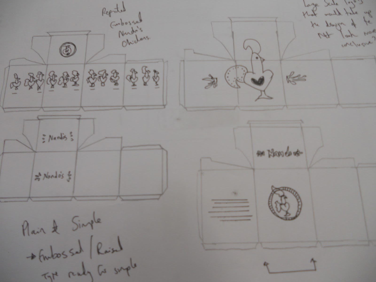

The NA-NDO-'S logo design works well but i feel that if actually tried to fit the format the design wouldn't look effective in communicating the message and product. The use of pattern within the design would be effective and maybe layering the logo as a pattern design could work in a more creative format.


I tried to arrange my logo design onto the net in a variety of ways, we were not allowed to change the logo design as it would misplace the design and we had to think about where the design would look most effective to communicate and advertising he product.
The designs created above are very basic and rough ideas. The use of using a template for sketching out my net proved to be very helpful and worked well when i needed to design at a fast pace.
Section 3
From these designs above we then had the task of creating 5 different packaging nets of our own. These designs had to include the one logo design of your choice and be incorporated into 5 net designs of your choice. The logo of the product had to once again remain the same and could be placed in duplicate places.
I created these nets on photoshop using a template i had drawn up form the packing i had previously collected. The designs are simple as i didn't want to over-enhance the products and wanted to focus mainly on the logo and logo placement.

Net for 'Sock Packaging'

Net for Cd cover


Net for Sports drink Label


Net for Receipt Holder


The design i chose to create are basic and have a very basic layout. This attempt at packaging is the first i have ever done. I felt that my designs were a little to basic for the product, they were also a very low quality of printing and image. I decided to start with basic format of layout for the packaging as i was not comfortable developing the designs in a complicated way.
Section 4
Printed Solutions and Feedback for the packaging designs. My low-res designs. If i had more time i would develop or re-do these designs as i feel that they do not represent a good base for graphic design work. I also need to spend more time on the designs and with templates and nets and learning how to execute a well design, well built packaging format.


Crit / Feedback:
STRENGTHS:
- ALL PRODUCTS WORK TOGETHER AS A SET / SERIES / COLLECTION
- INTRESTING AND CREATIVE ADAPTATION OF NIKE LOGO / BRANDING/ DIFFERENT TO CONVENTIONAL NIKE BRANDING BUT IDENTIFIABLE AT THE SAME TIME.
- DYNAMIC RANGE OF DIFF, PRODUCTS / NETS AND GOOD VARIETY.
- WORKS AS A SERIES
- INTRESTING DESIGN
AREAS FOR IMPROVEMNT / CONSIDERATIONS:
- CONSIDER USING WHITE SPACE MORE EFFECTIVLEY (ITS NIKE, LOGO SAYS IT ALL) USE TICK
- USE VECTOR GRAPHICS
- STOCK CHOICE
- EXPERIMENT MORE
-SOME IMERAGY IS PIXALTED, NIKE LOGO NEEDS TO BE A VECTOR
- 'POUCH' PRODUCT STYLE IS DIFFERENT - STANDS OUT IN SERIES / COULD INCLUDE GRADIENT BACKGROUND WHICH IS FEATURED IN OTHER PRODUCTS
- A GLOSSY STOCK WOULD BE MORE APPROPRIATE FOR RANGE
- FOLDING - MORE CRISP / CLEAN FOR MORE PRESENTABLE FINISH.
No comments:
Post a Comment