From the previous sessions i have developed and continued to look at type hierarchy. I have looked at flyers from Leeds 'Club Night' and looked through a good example of type structure in VICE MAGAZINE.
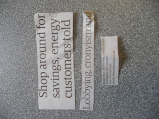
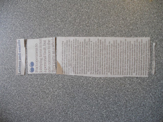
NEWSPAPER: TELEGRAPH:
HEADLINE // SUB-HEADLINE // INFORMATION
This newspaper developed a good type heoirachy system and used bold // large scale type as the main headline and then the type grew smaller to co-enside with the information.
FYLERS:
The flyer designs are all different but use the same type structure. They are all very simple and easy to read with regards to the letterfroms weight. Although there is a lot of information on these, you can clearly see the headliners due to the text being bold // large scale.
MAGAZINE : VICE:
I think that VICE is a well structure magazine in terms of layout. keeping things simple and allowing for important information to be seen clearly is key. With this extract I have highlighted the text in order of legibility. So i have chosen to place the more 'spaced out' characters in the title. I feel that the spacing allows for the eye to read it more precisely. I have then gone for a bold effect from the bebas typeface for the second. And from that i have developed the rest on a scale basis.
These are some extra pieces of type hierarchy developments i have made, and i plan to further this by creating some simple designs within photoshop to highlight my points clearly.


No comments:
Post a Comment