


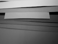
In this practical excercise. We looked at how colours appear different when they are placed next to different colours, even though we know its the exact same colour.
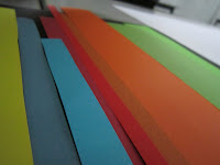
These are some 1st hand photographs of our early stages of experimenting with Colour theory and the types of theory studied:
EXPERIMENTING WITH COLOUR AND CONTRASTS:
Taking colours such as green and portraying this onto specific backgrounds such as a table, the floor, white and black paper:

SATURATION CONTRASTS


COLOUR CONTRASTS
These are the main 3 forms of colour contrast:
Contrast of Tone- Monochromatic Values :
Contrast of Hue- Juxtaposition of Colours:
Contrast of Saturation- Same colour contrast of saturation:
Other contrasts of Colour include:
Contrast of Extension/ Proportion- different weights of colour next to each other giving different results:


Contrast of Complimentary Colours:


Simultaneous Contrast - formed when boundaries between colours 'vibrate', often found in complimentary contrast.

Contrast of Tone
Every colour has a tone. Contrast of tone works from how dark the tone of the colour is. Yellow is the colour with the lightest tone, after white and dark blue is the colour with the darkest tone, after black. The closer the tones are together, the less noticeable they are. Therefore the different in the tone of colours put together, effects how you see the colour. A lighter tone will make a darker tone look darker.
Contrast of Extension
This works from the weight of the colour which is basically how much of one colour there is in comparison to another colour. A darker colour is generally heavier than a lighter colour but depending on where the colour is placed and how much of it there is, the balance changes. Some combinations need less of one colour to get the correct balance between two colours.
Contrast of Hue
The distance apart the colours are away from each other on the colour wheel effects the contrast of hue. the further apart the colours are, the bigger the contrast is. This contrast changes because the human eye can only base a hue on the surrounding the colour is in. Therefore it changes every time the exact same colour is viewed in a different place.
Contrast of Saturation
This works from the position of light and dark colours. The more vibrant he colour placed on top. this will make the more saturated colours look even more dull and saturated than what they actually are.
Contrast of Temperature
This works from how we associate certain colours with temperature. For example if something is red/orange, we generally associate that as a warm temperature and the same goes for blue being associated with cold. The temperatures of colours change when placed next to other colours .
Complimentary Contrast
These are colours that battle with each other when placed next to each other, which often makes the image start to wobble, go blurry and make it extremely difficult to observe or even look at.
No comments:
Post a Comment