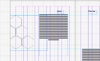
To develop my work in indesign i decided to document the main aspects of each section of the books i was creating.
The hexachrome shape works well for the section on colour systems and print so i developed the shape on illustrator and transferred the image across to indesign:
LAYOUT VARIATIONS:
The use of colour in the circles develops the type and is a section form the pantone matching system. How to lay this out on the page is interesting could have been:
Circle shape
rectangle
square
small distance to each other
etc
Overlaying and creating the images on backgrounds -
Arranging the paper stock pile onto the page layouts:
Screen Shot of how the book looks now:
Without the guides or grid lines on the design:
The deigns look very basic but quite modern and effective in picking up information quickly. Although i am not happy with how these designs are turning out i feel i have met the designs brief i set myself for a formal and informational purpose. I feel the layout is not too creative to stop the design being formal.
Resolutions :
Image Correction:
Chaning the image from back and white to various other techniques such as RGB colour cmyk and duotone.
Layout once more for 'paper and stocks designs'
PAPER SIZES:
To get the best possible designs i used this image below as a trace for my designs
The scale of the design varies and i have chosen to use the A sizes instead of C and b because A series is most commonly known.
Setting the right distance between my layers, type and fonts was quite difficult to master. the designs varied to demonstrate specific areas of the design, for example the weight type :
On some pages i wanted to keep the design very very simple: I did this with th etsock and paper booklet especially. i could create paper weights and stocks by simple illustration and shading developments. the use of this allowed me to creat a 'book page' effect whhc i thought could work well with the layout i ahd created.
Visually interpreting my designs:
This booklet demonstrates printing techniques i wanted to gather the images of printers and say how they are reconginised.
The layout is simlur to the other two books and will allow for the design to be expressed in a modern formal format.
I chose to add image of printers and to dutone these to keep relevance to the other design booklets i have created.
This development has taken me a long time to develop. As I feel my skill s on indesign and illustor are very very poor i have tried to use these skills as a massive learning curve which should hopefully allow me to create documents in the future to a higher standard.
If i could develop my designs quicker and with more skills i feel that the designs would have ben ore thought -out and creative. the layout i have deicd to go with is ext rely basic and makes the design look almost unthought of and cheap.
I would like to spend more time trying to utilise the new skills i have learned.


No comments:
Post a Comment