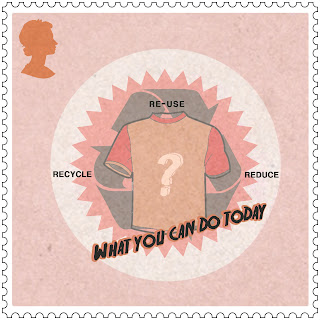
My feedback suggested that my images were to 'positive' and looked like they were aiming encourage audience and not tell them/warn them of the problems they are causing. my final designs also didn't have a storing enough solution to this so tat audience could see who they could help. So from this i have re-designed my stamps to hopefully meet the criteria better.
I used thee images and converted them in Illustaror and edit them until they reached my final product.
I decided to change the colour theme to red - as it creates the idea of a warning and also is very eye-catching. I have kept the same layout as i feel that you get drawn to the designs. The use of having shapes and bold contrast also helps this reason.
I have decided to just change the image within the recycling icon. I believe this one is one that most audiences can relate to as they can recyle. I will place iconic things that you can recycle in the middle of the stamp and some bold text to highlight why it s important. I feel that this is an improvement because ithe designs are now much more focused around recycling and it is relate to the audience.
NEW FINALS:
i have made these new designs in a 'cartoon' style. This is so that it sing as threatening to the audience. I have chosen to place a simple type so that it is easy short and to the point. The use of having a red colour scheme allows for audiences attention to be directly focused on the stamp.
WHAT CAN YOU DO TODAY? - RECYLE OR RE-USE OR REDUCE - TSHIRT
WHAT CAN YOU DO TODAY? - RECYLE OR RE-USE OR REDUCE - JUICE CARTON
WHAT CAN YOU DO TODAY? - RECYLE OR RE-USE OR REDUCE - TIN
I feel that my new designs meet the brief a lot better then my old designs did. Allthought I don't feel that they are very well design i feel that the idea comes across better which is the main point i had to portray from my feedback.


No comments:
Post a Comment