
Communication is a Virus
For this group brief we have decided to go for 'Get people to give more'.
We went down the route of focussing on the homeless.
Our concept is to make the homeless people of Leeds seem less unapproachable and hopefully change peoples opinions of giving to charity/ help the homeless.
I will research existing campaigns and companies that would help push this idea and document it on my design context blog.
Our concept is to make the homeless people of Leeds seem less unapproachable and hopefully change peoples opinions of giving to charity/ help the homeless.
I will research existing campaigns and companies that would help push this idea and document it on my design context blog.
Questions we could ask our audience:


- Would you be more encouraged to donate a can by sympathy or by knowing your helping someone?
- Would you be able to spare a tin of soup/ beans etc. for the homeless in Leeds?
- Is it uncool to be seen donating a can to help the homeless?
- Do you ever give change to beggars on the street?
- Are you aware of the work that St Georges Crypt do in Leeds?
- What are your views of the homeless? Lazy, Alcoholic, Feel sorry, depends on their previous situation
- What is most likely to make you remember to bring a tin? Facebook notifications, Tweets, e-mail, Posters, Fliers, Sticker
What are you aiming to achieve?
What do you want to say? How do you intend to say it?
We are trying to encourage people to give more by donating a tin for the homeless in Leeds.
We want to appeal to peoples good nature, grab their attention and convince them to bring a tin of food in that we will take to St Georges Crypt in Leeds. We will be displaying the promotional visual material throughout college, so our main audience is art students. We will set up a drop box or table near the student union/ mosaic bar and therefore will be able to measure the success of our campaign by the amount of donations we receive after a 2 week period.
Clearly defined and informed content
Information about St Georges Crypt
Research, survey response,
Audience,
St Georges Crypt do a lot of work for the homeless caring for around 100 homeless people a day, they welcome any donations and are grateful for any non- perishable products including tinned food, sugar, tea, toothbrushes, toothpaste, shower gel, disposable razors. We are going to focus on tinned food as this is the cheapest and most probable that a student will be able to spare.
The results of our survey show us that....
Audience
Our audience is students at Leeds college of art
Actual or proposed methods of delivery
Posters, fliers, stickers, internet pages.
Rough design ideas/ mock ups.
Chris started to develop some ideas on our plan and came up with these designs for labels for cans to do.
CHRIS' DESIGNS:


SURVEY:
We put together a survey based on questions we needed awnsering about the brief and specific ideas for the thought process we were going to make.
The people that answered the survey are all between 18 and 24, and the majority will go to LCA.
From the amount of responses so far, here are the results:
From the amount of responses so far, here are the results:

Conclusive that the majority don't give to charity at all, which suits our 'Get people to give more' topic.


16/19 people said that they would donate a tin of soup/ beans!

Almost conclusive that people don't like being guilt tripped by a sympathy vote.


THE DESIGNS OF TINS FOR PROMOTIONAL VALUE:
Chris decided to focus on the tins and wanted each tin we used for promotion to be like a specific and popular already out at the moment. We decided to use MORRISONS // HEINZ // CAMBELLS AND CHRIS DESIGNED A LABEL.

Limiting to 2 colours + stock


We then had to decide on 2 colours + stock for our final products. As a group we discussed and looked at various colour schemes that we thought would grab the audiences attention and make out designs stand out. We opted for red // black and stock. We feel this best corraletd all our designs into one.


FINAL PRODUCTS OF TINS WE WILL PLACE AROUND UNI:
As Chris was preparing the tins we had to start developing flyers and posters to place around college. We also had to create the posters using the red and black theme.
ANDYS POSTER DESIGNS:
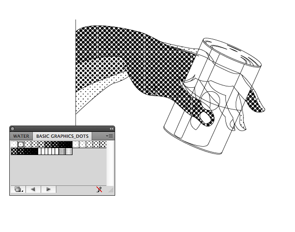


We stuck to the colour theme and half tonnes the images so that we use the 2 colours. We were impressed by this poster as a group and felt that we could use these well and that the message translated well. But at the same time we thought that we needed a poster design with information to place under this design to explain the process and the organisation we are.
POSTER 2 DESIGN - MY DESIGNS


Without the border of the logo for ST.Geoerges crypt. JO thought that the border didn't work against the rest of the designs so below is the design without:

Printing our final products ....
Here are the final posters we have create, We decided that our stock would be antique white as we liked how the hand poster looked on this stock.


I wanted to create an informative poster that was very very very simple in explaining all the information. i WANTED TO INCLUE THE LOGO FORM ST.GEORGES CRYPT AND AT THE START THIS WAS GREEN, BUT AFTER WE DECIED TWO COLOURS I HAD TO CHANGE AND MAIPULATE THE IMAGE TO BECOME ON THE SAME PATH AS THE REST OF THE DEISGNS.
FYLER DESIGNS:
I desiged the Tinner flyers asa another simple explanation of the designs. Andy used his poster designs to create a more condensed variation on the other flyer. We think that we will also create stickers also.

FYLERS IN CONTEXT:
COMMUNICATION IS A VIRUS // VIRAL COMMUNICATION - SOCIAL NETWORKING PROMO:

THESE ARE THE STICKERS ANDY CREATED USIG THE SAME TYPE AND THE TYPE ON TINS AND SOME OF HIS ILLUSTRATIOS - I PUT THE RED BACKGROUND ON THE STICKERS AND THEN I CREATED THE TINNER STICKER.
I came up with word 'Tinner' which means 'someone who has donated a tin'
The word was supposed to be ambiguous so that people would see others wearing the sticker and ask them "what is tinner?' and the tinners response would be "Oh, I donated a tin for tins of things and got it." to generate a bit of word of mouth advertising.

This is the crate in the studio ... We have placed both posters above the crate to try and convince people into donating a tin ...
As you can see we already have quite a few donations ...

This is the spot in the mosaic bar in college we were given. Again we have place both posters here in hope people will donate. People have to pass through the mosaic bar every day so this is a good place to have a crate so people can just drop in a tin when they walk past ...

DISTRIBUTION OF TINS X2
With the tins that Chris created we wanted to place around the college so people could be intrigued by them// pick them up and read the information and just for general advertising. Heres a few of the tins in context;
Overall i feel that the design process went well and that we created some products that were quite unique.
WE RAISED 68 TINS OF THINGS TO GIVE TO THE ST. GEORGES CRYPT!
No comments:
Post a Comment