
This was the first Grid System I created:


Here are the designs Sheets I achieved from this:
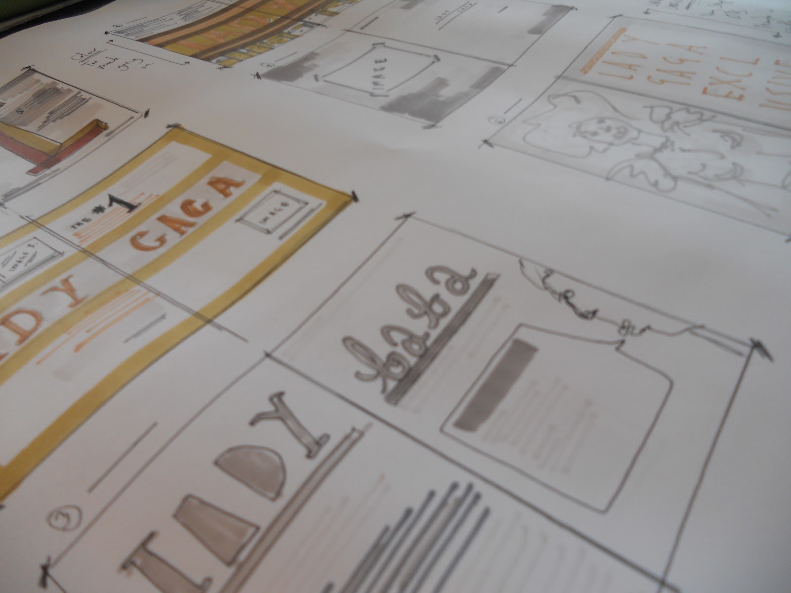
I used tonal colours from which i found the were in the actual magazine. Instead of focusing on a lot of text i tried to incorporate the images in a more creative way.

With the designs, Lorenzo asked us to focus on layout. Important information i gathered from this was that type can't cross over the DPS without being extremely bold and readable or legibility will be very difficult.

This was my first design. Its seems very basic in terms of layout but i feel it could work quite well. I don't like the colour choice i have picked as i feel that the two pages don't work as a set. The design of the dos however I think would be quite eye-catching.

Using different typeface's canoes up the design and allows for more expression. I feel that these design are very poor however and will have to create more.

This design sheet i feel looks very basic and i feel that i could improve them, so i am going to create another that will hopefully be vastly improving on this design sheet.
No comments:
Post a Comment