
Legibility: How easy it is to distinguish individual glyphs, this is affected by point size, stroke thickness and size of counters.
For this section of worked, we were asked to create a hierarchy of typography from 3 different sources. One from a magazine of your choice, another from a newspaper and one from a poster of your choosing. From these we had to then create GOOD, BAD or OK selections of type we like in various orders such as, scale, point size, boldness readability etc.
Magazine:
We have to collect the information from one page of the magazine and then order the type.
BAD
I have chosen take a break magazine's front cover because i feel it has everything wrong about it. Contrasting colours and a mixture of typography and to much colour makes it difficult to look at never mind read.


I based this form of type on the scale. It varies from large to small, as the point size gets smaller. The use of boldness also comes into play. The scale and boldness of each section of type i feel interlink to create this hierarchy.
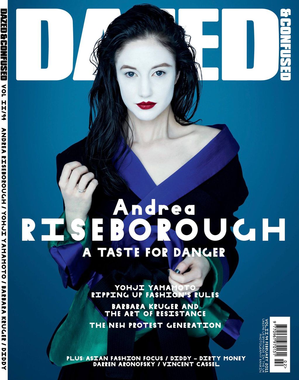
AVERAGE
I have decided to use Dazed as average because i feel that the text used differs. Although the scale is simpler and the layout as a whole is clear and easy to read i feel that the overall type used on this could of been enhanced.

I feel with this type of magazine, the quality is normally very good. I have once again cut up the type to create a hierarchy based on scale. The use of a bigger point size for the header is eye-catching and does it's job, but i feel that the smaller point size is too small. it takes away from the good subject mater and important information that needs to be read. The use of breaking this down into sections make it easier to read.
GOOD
I have chosen to use elephant magazine as my main good choice of magazine. I feel it uses type and negative space so elegantly that it creates a perfect balance between the two. The use of using larger point size to effect the scale works well as this magazine counter balances the big with the small when it comes to text.


I have chosen once again to determine the form on the boldness of the type. The use of strong bold letter forms creates an easy look for attention. Also the thin yet bold letterforms also adds a section of scale as they add less important information in a smaller context.
Newspapers:
With newspapers its always clear that they create a lot of text with different typography. The use of adding different scales is also efficient in the industry as it develops the importance of text as a newspaper is an informative piece for audiences.
BAD


AVERAGE


GOOD
I have chosen to use the independent for this good version. Their logo and their overall layout is quite effective. They order the information in an informative and precise way. I have chosen to order my work in order of legiabitly so the text you can see clearly will place first.


The Independent does not over crowd on text thats why there is less of it on this hierarchy. I belivee that the logo and overall design is best for the public to gain information because it is clear. It also is aided by visual pictures which link to the text to make it stand out even more.
POSTERS:
Poster designs are often a lot better at developing a good link between using type. They tend to balnce the number of different types used and they also allow for any negative space to create the type's impact which is good.
BAD


This image is horribly bad. The main two type designs do not link together and colour scheme is off. The use of scale is extremely bad and readability is hard. I have ordered this in design context of legibility. The easiest section to read is at the top and it deteratates into a section which i cannot read.
AVERAGE


I have chosen to use this poster as an average one. The text is almost going down in scale size which cis good as it has the main headliners at the top. The use of doing this good factor. i have ordered mine in legibility order once more to see what factors develop.
GOOD


Using type on poster designs which create a good sense of what it is trying to portray clearly is effective. The use of having type is scale, point size, oder, readability, legibility all pays off.
Although this poster uses various types of type and size it work extremely well because it fits and it is clear.
No comments:
Post a Comment