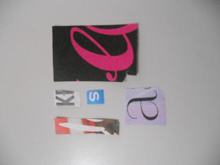
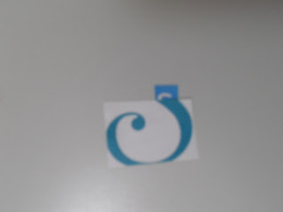
I chose the letterforms as i feel they stood out to me most when looking through different materials. The A is bold and quite strong online the S which is quite fluid and creative and looks to be created using a handwritten approach. The K letter from is also strong and has no serifs to create a traditional look but uses block structures to create a modern approach. The L letter from is unique as it is bod but dent portray as ugh presence as the other letterforms and the E letter from is quite traditional as serifs add to the weight of the letter.
LOWER CASE:
BOTH:
We had to then form a completely new letterform by blending the upper and lower case parts together. i chose to create letterfroms that would not usually work. In they case i used a lot of the boldness from the letter from A upper case. I added in quite 'pretty' and hand scripted aspects such as the centre attachment of the lowercase A.
Here i used the letter forms from the upper and lower case E. i thought this way of combining the letter from would be quite effective as it allows from a variation of weight and line structure.
All the new letter forms :
I feel that the new letterforms created from mixing the old ones doesn't really work very well. i feel that i can re-produce this work in my own time ready for the next stage of the task.


No comments:
Post a Comment