Aesthetics and Structure.
CONSTRUCTION
OF GRIDS
You need to know what your making it for;
Paper Sizes, Quality, Volume > gather all information.
Always start with small sketches
Thumbnail your sketches > layouts will be easier and productive
Thumbnails should proportonate the final format
Final layouts will be easier and productive.
1. column only for text and illustrations gives little freedom of layout
Restrictions of making illustrations small, medium, or large
2. Columns logically gives you more space :
- one column for text
- one column for illustration
they can be mixed together
2 columns can be sub-divided.
INSERT IMAGE FROM SLIDE SHOW HERE
Three columns is more opportunities for layout. Subdivisions.
Column grids useful for - newspapers / phonebooks etc
Disadvantages : lines of text narrow > small typeface
Function : Solely rests on the function that is to be preformed.
For static's figure graphs and trend publications use 4 GRID COLUMNS.
subdivide > narrow text > FIGURE OUT IF IT NEEDS IT FOR PUBLICATION
The width of a column dictates the size of typeface used.
The rule:
The narrower a column is the smaller the typeface
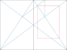
Thumbnails:
Always make a variety of thumbnails layout and designs
Do not rely on one set of thumbnails.
Enlarge a small selection of appropriate thumbnails by 1:1
Compare them and select and repeat process until you get confident
It is about generation of ideas.
FIND SOMETHING THAT WORKS FOR YOU
APPLY TYPE TO COLUMNS
The first line must fit flush to the top limit of the column grid
The last line must stand on the bottom limit
Keep calm, it is difficult to find the final solution the 1st time around
It could mean that your grid field is too hight or low / or point size and leading is wrong.
Measure height of column
EXAMPLE:
10 point type
15 point leading
Column length 15cm
Loosely means use 15pt leading
at this length there must be 10 lines per field
meaning 30 lines every per 15cm
The depth of my fields ascertains how many 10 point type lines i have.
Match grid fields to the line of text that live next to the field line
It must be measured as 1 line space. A proportion of leading and type point size.
Top of image should match top of ascenders.
T (type) [] (image)
FONT HEIGHTS
Caption text : Proportions
TYPE AND PICTURE - 8 FIELD GRID
A4 FORMAT
8 &20 GRIDS
8 GRIDS ARE USED FREQUENTLY FOR ADVERTISING
20 FIELD GRID HAS A LARGE SCAPE FOR IDEA SOLUTIONS
42 POSSIBLE LAYOUT COMBINATIONS AND LAYOUT OPTIONS.
GRID IS ONLY AN INSTRUMENT IN WHICH YOU, A DESIGNER, CAN MAKE INTERESTING AND BALANCED DESIGN.
*
THINK OF THE PURPOSE OF TEH JOB?
AESTHETICS?
STRUCTURE
TASK
For the next couple of weeks, create a concertina fold (printed document) no little then 5 - no bigger then 16. Content can be projects you work on at the moment.
(1990's) - Layout
Look at what you did within the first week to map the progression.
Dont want to see straight information
challenge way its presented / understood
be creative / interactive
Use mixture of all grids for different reasons.
2 PAGES - CANNON - 2 PAGES - 8 GRID - MIX IT UP
MAKE AND BREAK GRIDS
Think about how you use type and image
Dynamic
Don't be flat and linear.
Concertina in In-design: