
WORKSHOP TWO:
The rule of thirds governs the placement of ponts of intrest in a scene,
Divide any given image into thirds both horizontally and vertically.
Break down of websites and images.


Information point : Used portions even though it has been badly designed.

Cannons:
Type and Grid,
VAN DE GRAAF
Simplified layout and simple.
A gridded page is much like scaffolding for building
It is a structure that elements can be organised
A grid will help with continuity to be maintained and information with a digested flow.

A semiotical design:
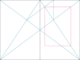
Perfect proportion of you page:
Symmetrical Layout:
[] []

There is more space on the witch and sides of the boundary boxes because you need to holding the publication, so it is space for the hand, whilst still mainting perfect proportion.
A-symmetrical Layouts also applicable.
Octavo Format:
Using this there is an simpler applied version:

Golden page and Rosaries' Rule of 9th:
Simple understanding of how to apply Grids:

Creating my own:


Leading / Margins:
Place images HERE
Creating My own Grid
AND
Double Page Spread


No comments:
Post a Comment