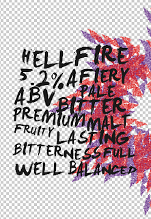
Creating the pattern for the background of the hELLFIRE bottle.
I wanted the backgound to standout but take in the 'firey' elements.
The design here takes on quite a feminine approach. The fire symbols have been arrangement to look like a flower or a ;burst' of flames. The colours are still effective but I think the design may need more development as it is akward to place he symbols and logos that need to go on the deisgn.
FINAL PATTERN:
The design takes up most of the lable space and allows room for the type to be placed centred aliginged. The organised pattern expresses fire, but keeps with the softness layout of my initial plans.
Changing the colour:
Does it work?
When asking for feedback, two people suggested that i should change he colour of the designs. Suggested colours where purple and yellow, purple and green / yellow - red.
I decided that i liked the purple so added the yellow. Although the design looks simular i feel that the final outcome doent look as 'finished' and doesnt convey 'fiery' aspects.


No comments:
Post a Comment