
DESIGN DEVELOPMENT:


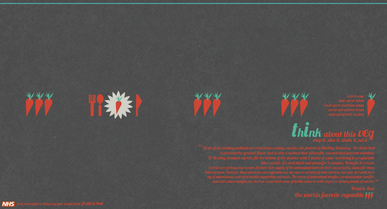
From looking at my other designs i let that there needed to also be another horizontal poster design. I wanted to use a similar layout to the other so i shoe to focus on veg instead of fruit. I chose to focus on carrots because from the research i had gathered carrots where the no.1 veg in the world. I decided to create a plate look with the symbol of fresh is best as the placate and then create knife and fork. I wanted to image to look bright and attractive. The layout seems to have got a bot chaotic, There might be a bit to much type on the poster design and probably would be more suitable for a booklet.

NHS logo is used in my work and as part of the FRESH IS BEST publications.
DESIGNS THAT DIDNT WORK
These designs didn't seem to work. I STARTED TO DEVLOP A PLAN FOR A CALENDAR IN WHICH WAS INTERACTIVE SO THAT overweight audience could take back with them and start to use. i thought the idea was effective but from the research i had gathered i didn't feel it would be as suitable for fresh is best. the layout was quite tricky and i felt that i dint work at all looked boring and was not as creative as i would of liked.


I also tried to develop the use of info graphics into a poster design: using simple symbols so it wasn't that hard to communicate vital staticsc i thought would have been effective, however when i started to develop it once again it looked to simple and boring.


FLYER DEVELOPMENT:
With these flyers i wanted to create a visual awareness of where fast food resturabts are and how many of them there are. I decided to focus n amercia as that country is renowned. I create a map and then placed symbols and added a key so you could see the number of restaurants in that area.

The back of the postcard was quite formal with 'don't become a static is' on the back. One final quite and a message was all i placed there. I also added the symbol.


This is an image of the map and the key. i decided to use the same colour theme and allow the dark and the light to contrast with each other.


LOCATIONS- on the map. i USED SHAPES THAT CAUGHT THE EYE TO DEVLOP THE LOCATION SPOTS.


Background Information - the background of this is light and allows for legibility. The use of creating large numbers on a simple design front allows for the audience to be interested.


I created these separators and linked them to the information portrayed. This represents the Chicken Wraps.


This represents the fish salad.
This flyer design is probably my favourite. I think the patter works well as it is just repetition. The use of having a banner idea for the flyer also works well i feel. It is very simple however.


LOGO AND PATTERN


Logo design in basic shape - layout of shape is effective when grouped -
Could be stickers?

No comments:
Post a Comment