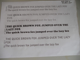
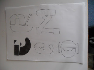
I looked at the typeface periodic table and looked up the most common typefaces. I wanted to steer away from using these so that i could manipulate less know typefaces into new letter forms:
This sheet also helped me notice the difference in type weights act. Each type is one from history that has influenced us further and from these letterfroms, people have manipulated them and create new designs:
Here are my new letterfroms that i have created from using existing letterfroms. I feel these are more creative then the last ones i created and i now feel comfortable with using them to continue in the session.
R:
M:
I feel that r AND m LETTERFROMS are probably the most creative out of the designs.
I then traced the design so i could upload them onto the computer for the next stage of the session.
SCALE :
We had to create a scale format for each of the new letterfroms we had created, here is the main examples of this:
NAMING THE TYPEFACE AND NEW LETTERFORMS:
I used names that combined aspects from the types of letterfroms i had used, for example the E letter from was called - SEPARATE CURE EXTRA HEAVY.
We then chose one letter from, which for me was the letter R. With this we had to make the letter from different weights:
Normal:
Light // Italic:
Regulare // Italic
REGULAR:
Bold // Italic:
Bold:
Ultra Bold:
Ultra Bold // Italic:
From these sessions, my knowledge of letterfroms and creativity has been influenced and i enjoy looking at type and the sections that make letterfroms etc.


No comments:
Post a Comment