Throughout this module I have
developed skills on various types of research. I have branched out and used
different methods of research skills such as Quantative and Qualative methods
and First hand research. By using this it has helped me to develop my work
and allowed me to efftively apply the information I researched into a visual
format. I feel I applied these skills quite well to my blogging and final
publications but I feel I could have enhanced these a lot further. I could of
got more creative end products but with the information I gathered I feel if
I would of made the end products intimidating it would of ruined the solution
to my problem.
|
I have approached a selection of
methods to my design production and I feel that they have informed and
developed the development process. I have undertaken many design sheets,
which offer different solutions. I have experimented with design sheets on
publications branching from posters to stickers; I have also developed design
sheets on layout/context/content/colour/variation and the relation between
type and image. I feel that these methods have allowed me to experiment and relate
my ideas to the subject matter.
Creating illustrations and design
pages on type and images separately I have been able to come up with some
visually interesting layouts.
|
I feel that I have worked well on
keeping my designs simple and to the point, which Is what I set out to do. I
believe that they all work as a set due to this. I feel that I have also kept
the colour scheme continuously and that the layout of my designs maintains
the same structure through the use of pattern, symbol, type and image. I
believe that they do work well as a set but feel slightly boring. I feel i have worked well individual hand in groups to develop my work further and to manta an equal balance and share of work.
|
|
I feel that my designs are quite
2d and flat in comparison to other designs I could of created. I feel that I
have played it rather safe and I don’t feel that the designs represent me a
designer very well. I have not identified my target audience well and it is
unclear what function the designs have. I feel that I focused too much on the
design and les on the function of my products. Even if I had created a
website as a link from the posters I feel that would of developed them
further for the target audience.
|
-
Function: Will be a main
section of my work and allow me to portray ideas and solutions to my target
audience. I will expect to gain a greater understanding of my work and it wil
translate clearly through my publications
-
To develop and create
design sheets further to gain more ideas and inspiration for design
processes.
-
To allow extra time to change
idea and add extra sections on – Develop time management skills. So that I do
have time to make extra changes.
-
To experiment further with
design – not stick to the usual posters/flyers, I need to develop confidence
in other aspects f design so I can use them in the future.
-
I will use illustrator to
create more designs – to develop my skills as a designer.
 |

Showing posts with label 100 THINGSOUGD405. Show all posts
Showing posts with label 100 THINGSOUGD405. Show all posts
Wednesday, 8 February 2012
MODULE EVALUATION


DESIGN DEVELOPMENT - 100 THINGS
DESIGN DEVELOPMENT:


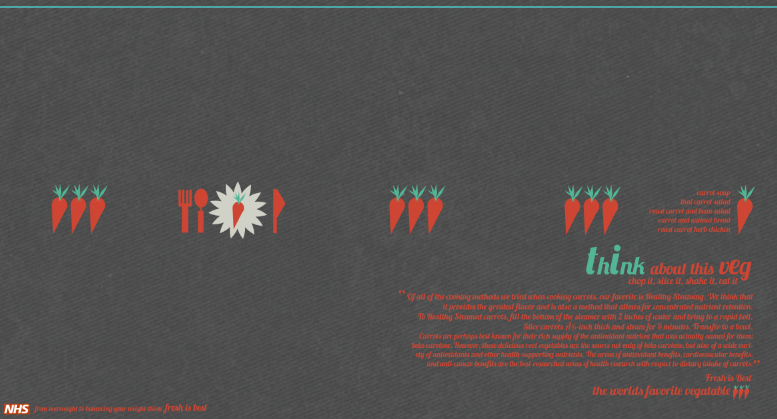
From looking at my other designs i let that there needed to also be another horizontal poster design. I wanted to use a similar layout to the other so i shoe to focus on veg instead of fruit. I chose to focus on carrots because from the research i had gathered carrots where the no.1 veg in the world. I decided to create a plate look with the symbol of fresh is best as the placate and then create knife and fork. I wanted to image to look bright and attractive. The layout seems to have got a bot chaotic, There might be a bit to much type on the poster design and probably would be more suitable for a booklet.

NHS logo is used in my work and as part of the FRESH IS BEST publications.
DESIGNS THAT DIDNT WORK
These designs didn't seem to work. I STARTED TO DEVLOP A PLAN FOR A CALENDAR IN WHICH WAS INTERACTIVE SO THAT overweight audience could take back with them and start to use. i thought the idea was effective but from the research i had gathered i didn't feel it would be as suitable for fresh is best. the layout was quite tricky and i felt that i dint work at all looked boring and was not as creative as i would of liked.


I also tried to develop the use of info graphics into a poster design: using simple symbols so it wasn't that hard to communicate vital staticsc i thought would have been effective, however when i started to develop it once again it looked to simple and boring.


FLYER DEVELOPMENT:
With these flyers i wanted to create a visual awareness of where fast food resturabts are and how many of them there are. I decided to focus n amercia as that country is renowned. I create a map and then placed symbols and added a key so you could see the number of restaurants in that area.

The back of the postcard was quite formal with 'don't become a static is' on the back. One final quite and a message was all i placed there. I also added the symbol.


This is an image of the map and the key. i decided to use the same colour theme and allow the dark and the light to contrast with each other.


LOCATIONS- on the map. i USED SHAPES THAT CAUGHT THE EYE TO DEVLOP THE LOCATION SPOTS.


Background Information - the background of this is light and allows for legibility. The use of creating large numbers on a simple design front allows for the audience to be interested.


I created these separators and linked them to the information portrayed. This represents the Chicken Wraps.


This represents the fish salad.
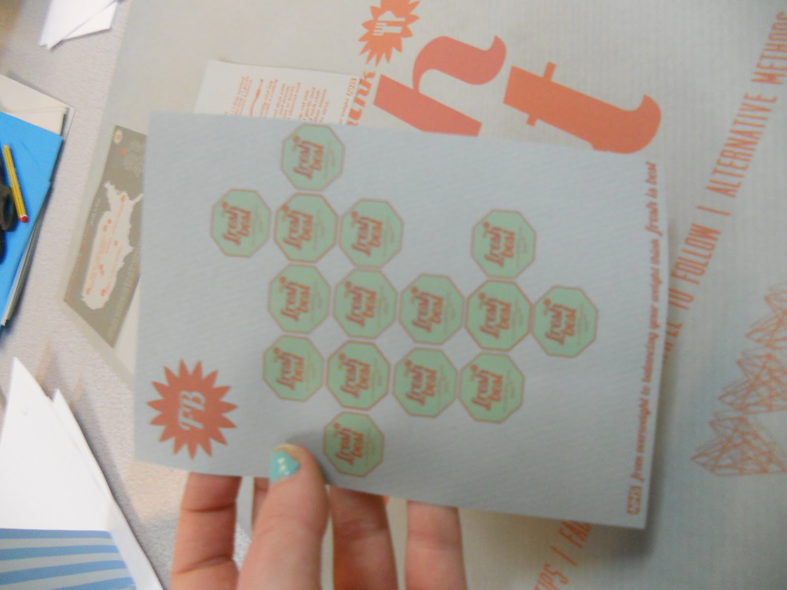
This flyer design is probably my favourite. I think the patter works well as it is just repetition. The use of having a banner idea for the flyer also works well i feel. It is very simple however.


LOGO AND PATTERN


Logo design in basic shape - layout of shape is effective when grouped -
Could be stickers?

Subscribe to:
Posts (Atom)